Problems
When Dashers are shopping a customer’s grocery order, there inevitably comes a time when an item is out-of-stock and the Dasher needs to know what the customer wants. Sometimes the customer will have shared substitution preferences in advanced, some items have plenty of good alternatives we can recommend, but for 26% of cases Dashers need real-time customer input to get them what they want. However, ~50% of customers didn’t respond, often resulting in items going unfulfilled.
I worked with our team to look at the customer journey and identify the root causes where communication between customers and Dashers was failing and how we could increase customer response rates. I aligned our team around 3 hypotheses:
- Expectation setting: Customers don’t know their Dasher might contact them
- Awareness: Customers can't easily tell what needs action vs. is nice-to-know
- Ease of action: There’s too much friction for customers to respond
Below are highlights from our vision work focusing on the last 2 problems.
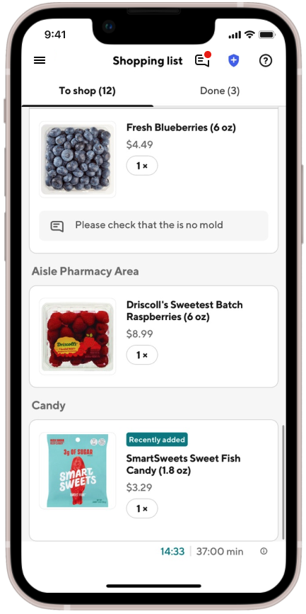
some of the ways we ask customers to respond
Pick a substitution
Dasher sent a picture or message
Dasher sent a picture
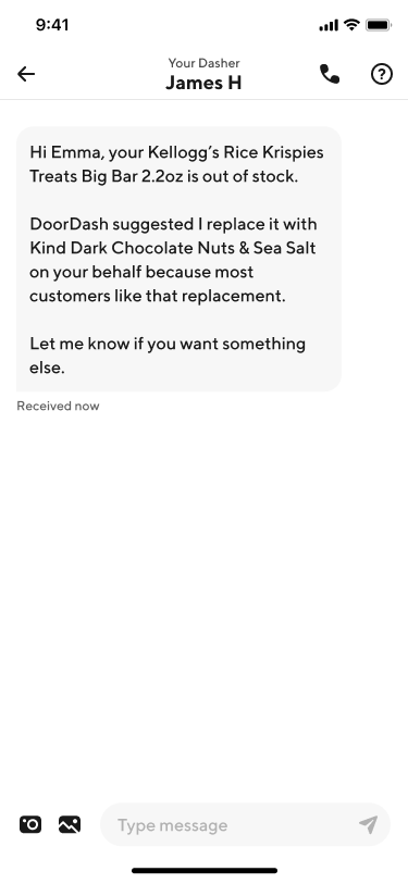
Dasher sent a message
Opportunity
My approach at a high-level was two-fold:
- Reduce noise in order to highlight important, urgent action
- When customers need to engage, make it nearly effortless to respond
Key considerations included balancing customers who value using DoorDash for it’s convenience, the Dasher’s need for time sensitive input while at shopping the store, anxiety communicating as a non-native English speaker, and unpredictable data connection in grocery stores.
Impact
I aligned stakeholders across design, product, eng, and operations around a clear problem framing, got the work prioritized on the roadmap with a shared understanding of north-star principles, and delivered a strategic foundation—including hypotheses, well-documented problems, and solutions for future teams to pick up or build on.
While I left DoorDash before the work was shipped, this project left a blueprint identifying all the gaps across the system and a way forward that was aligned across cross-functional teams.
Solutions
Dialing down the noise to dial up clarity
In a world constantly pulling for our attention, we rethought our notifications strategy for keeping customers informed about their orders during shopping. We ran tests removing “nice to know” order updates, gave notifications a much needed copy overhaul for clarity and conciseness, and were able to get down to the lowest level of detail of how much transparency customers expected.
✍️ Language is the starting line for clarity
Meeting customers where they are
We also recognized the shortcoming of notifications–customers aren’t sitting at home looking out for messages from DoorDash. (They’re living their lives, as they should be!) Once a customer places their order, they shouldn’t need to actively monitor the DoorDash app or sift through our notifications.
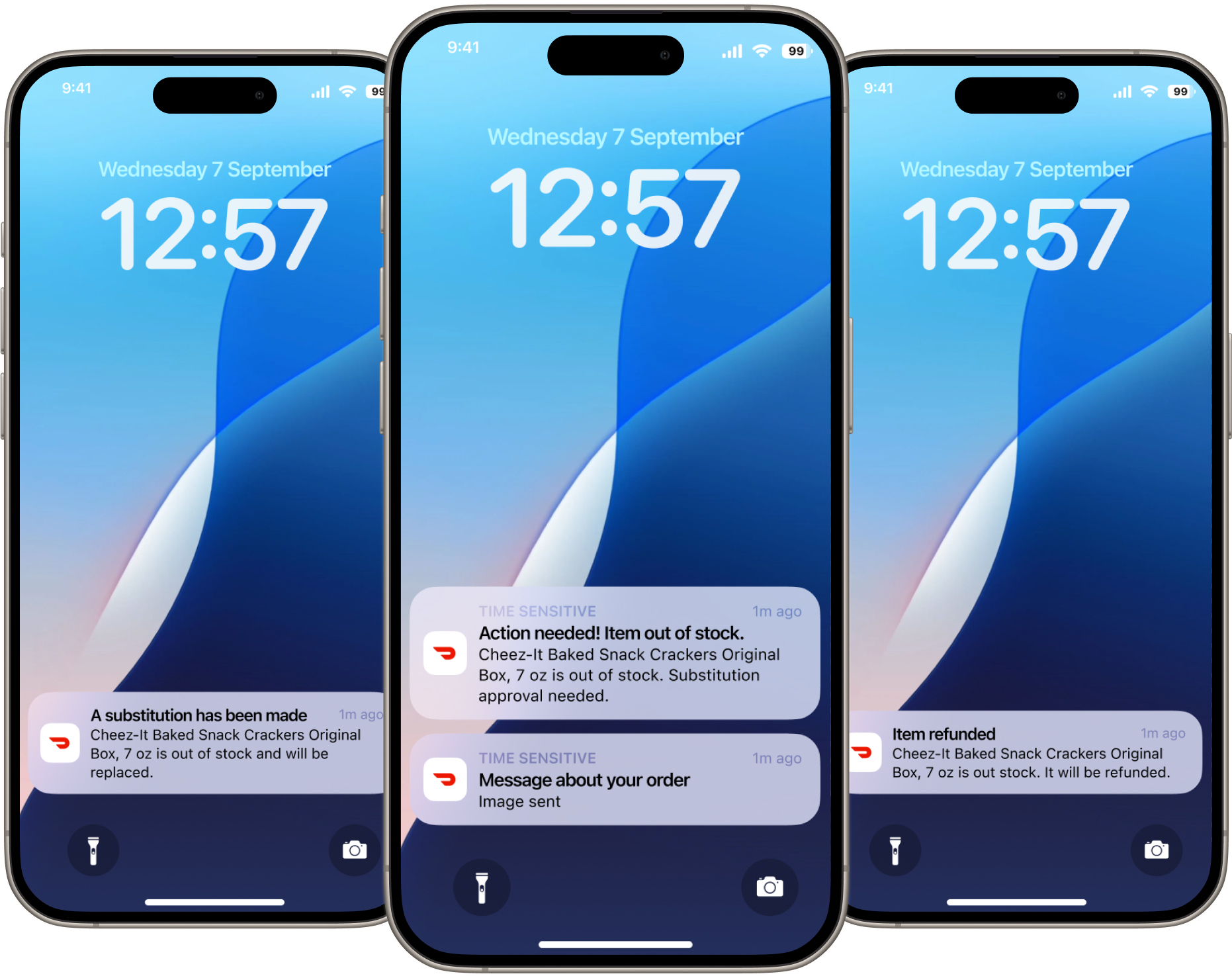
One of our big bets was meeting customers where they are by letting them passively keep a 10,000 ft. view of their order via Live Activity, and only use louder alerts when there are urgent issues with their order–like when items that are out-of-stock and when their Dasher needs their input.
Bold alerts draw attention when things go wrong and needs customer input
Make responding nearly effortless
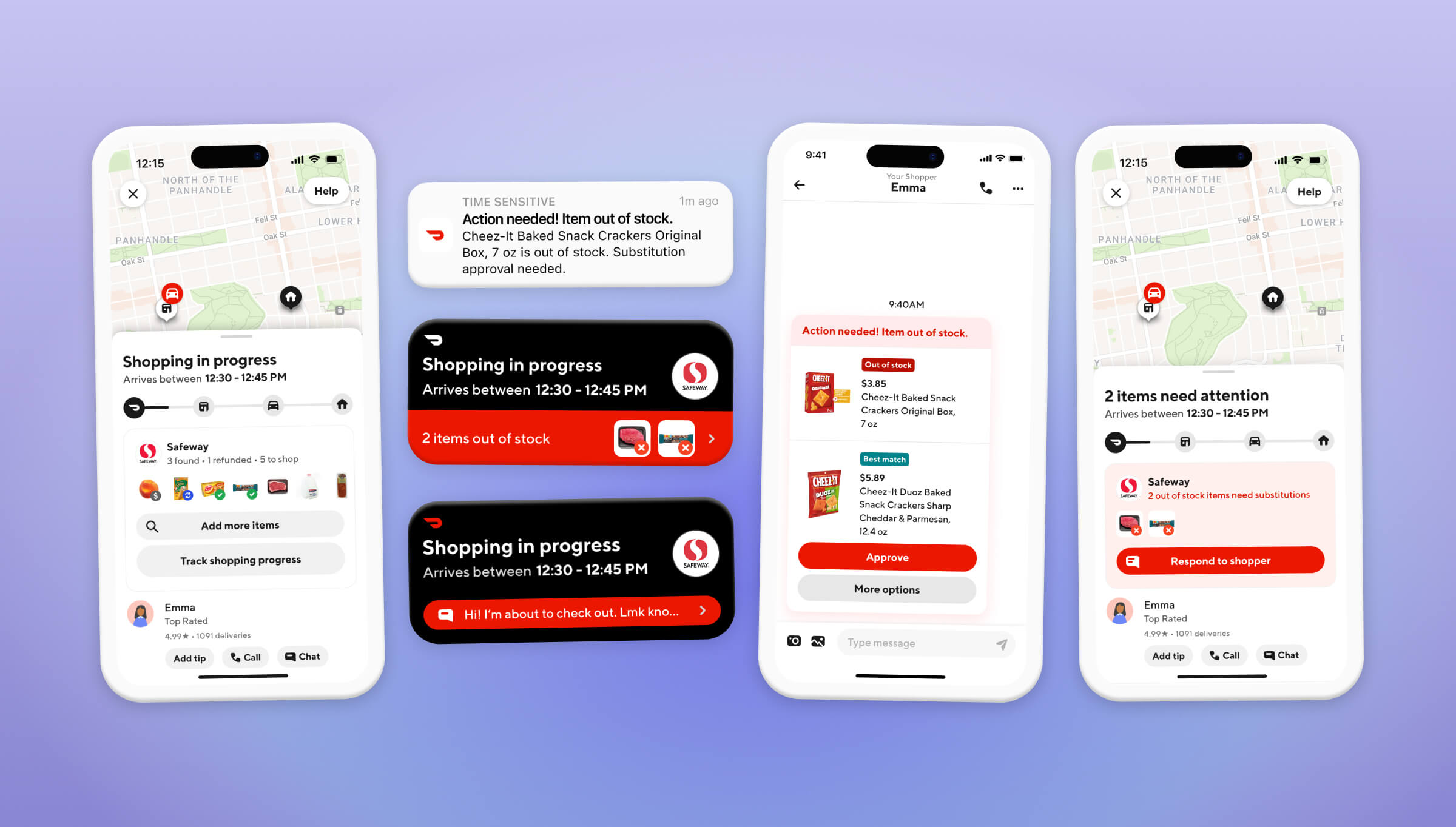
When customers wanted to engage and clicked on our notifications, they either landed in Chat or on the Order Progress page depending on the scenario. When urgent, time sensitive action was needed, managing multiple surfaces was overly complex. To simplify this, we proposed always driving customers to Chat as the place where they can approve substitutions in 1-click or easily text their Dasher to work out a resolution.
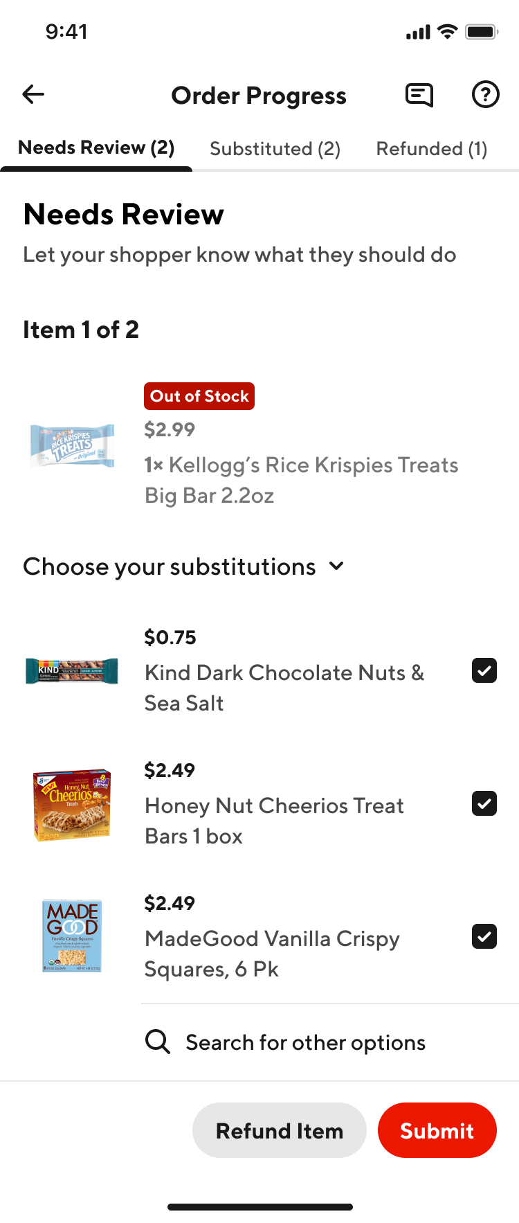
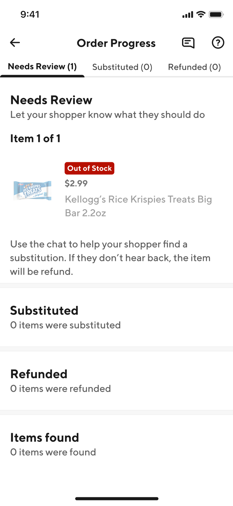
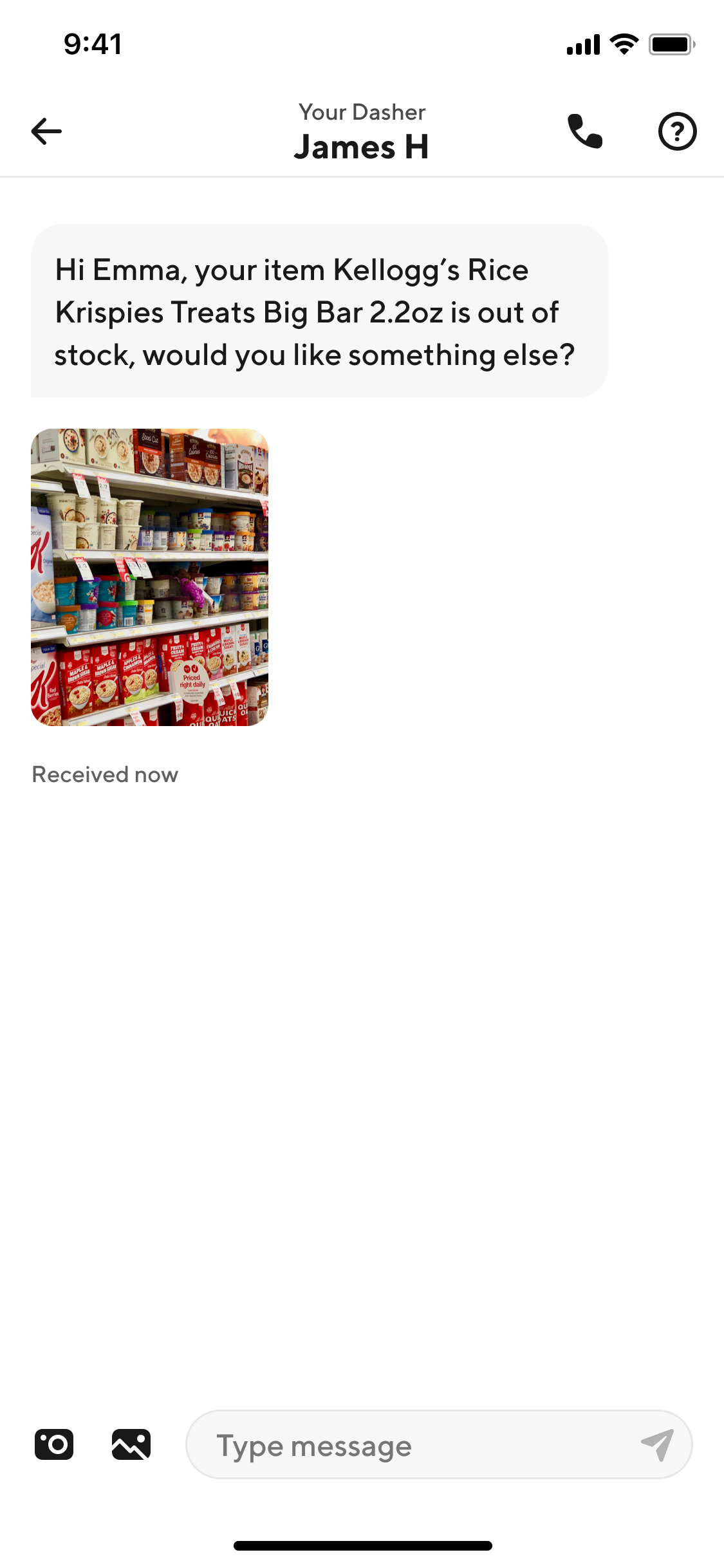
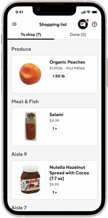
I also introduced the concept of Subs Cards in Chat that visualized which items were not available, what was picked, and what actions customers could take. At the time, we often sent customers text messages, and sometimes a picture, in Chat to inform them their item was out-of-stock. My design would reduce the need for customers to read messages to understand the situation and made it clearer if action was needed.
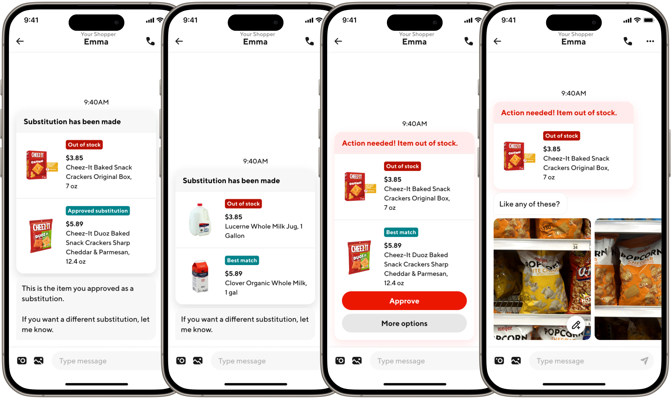
Customers can respond to out-of-stock items in one place in a more visual, dynamic way
Ensure Dashers never miss the customer's messages
When a customer messaged their Dasher, it was essential for their voice to be heard. When Dashers shop for items in the store, they’re not constantly looking at their phone and sometimes missed messages. Low signal in grocery stores also played a role in delaying communication and getting messages on time. The infamous little red notification dot was easy to miss and not always reliable.
To make customer messages unmissable, we proposed displaying them more prominently in the Dasher app and being louder when there are unread messages.
Before unread dot gets lost
After bolder state and pulse emphasize unreads
Customer is always in control & aware of their order
When no action is needed, or just at any point during their order, customers should feel like they have full control and introspection into their order if they want it. At the time, we had 5 different surfaces where a customer could take different actions on their order while it was being shopped. We lacked a clear perspective on where customers should oversee their order.
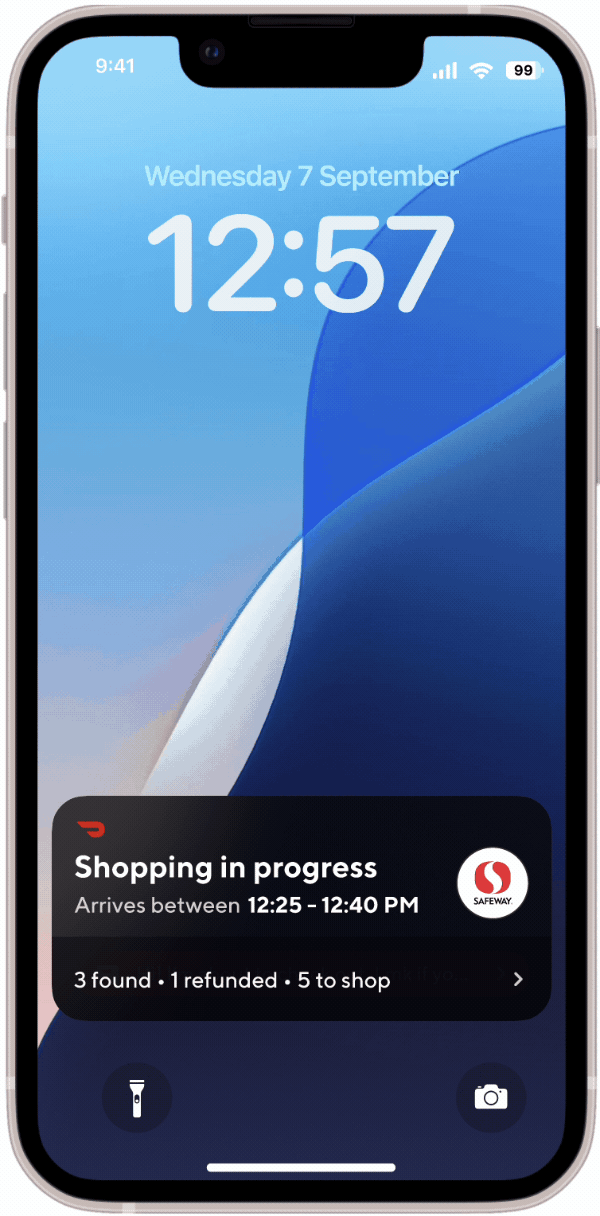
Our approach was to leverage Live Activity as the first point of contact for communicating order updates, ensure key actions were always accessible from the Order Tracker throughout the journey, and make the Order Progress page the customer's control tower where they can monitor and take action on their items, add new ones to their order, manage substitutions, and easily access their Chat with their Dasher.
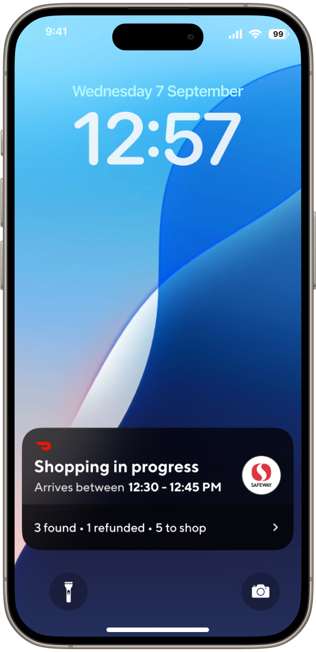
Live Activity gives customers full awareness into their order wherever they are
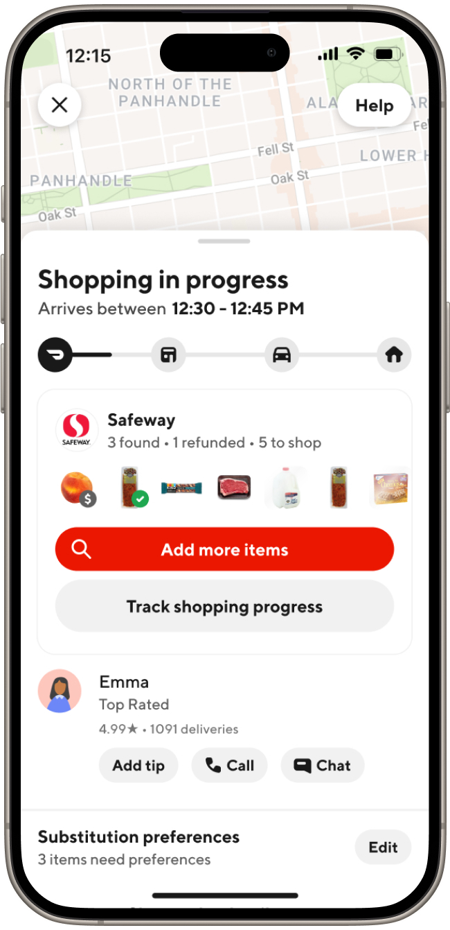
Order Tracker not only highlights ETA, but brings key actions front and center
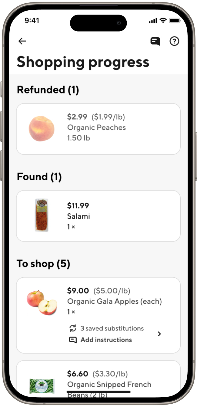
Order Progress lets customers see what has been shopped, manage substitutions, and access chat more easily